
Unified Supporter Experience Design Sprint
I organized a design sprint to help us envision a unified experience that inspires loyalty to St. Jude by delivering the right experiences at the right time, enabling anyone to support the mission how they want.

-
We started the week-long design sprint by interviewing a panel of St. Jude supporters. They echoed similar things we had heard before in donor interviews:
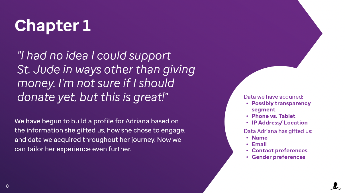
St. Jude supporters give more than money, they donate their time, friends and data.
They want to be appreciated and approached to provide these types of donations other than just monetary asks.
They don’t understand the the full impact of St. Jude’s research on childhood cancer and other catastrophic diseases.
Our storytelling doesn’t always come across as authentic, donors wanted to be able to empathize more with what our patients encountered while being treated.
-
We have a plethora of online and offline touch points necessary for a unified supporter experience.
Our experiences are siloed because we aren't working together. We need to work together to impact the bigger picture.
The slides below show the high level vision journey that reflects the outcome of the sprint.


Digital Design System and Guidelines
I worked to define how we could create a user-centered approach to plan, roll out and measure the impact of a thoroughly integrated, centrally managed, distributed digital design system.

-
I interviewed and surveyed over 30 UX contributors across the organization to understand the full scope of what it would mean for ALSAC to have a design system.
I identified that digital design roles are scaling through the organization faster than we could confidently support them:
Multiple places stored digital design and development documentation and pattern libraries had no central management
Digital design documentation is not synced with tools that output user-facing digital experiences (UI development tools)
Multiple digital design and development tools with overlapping capabilities
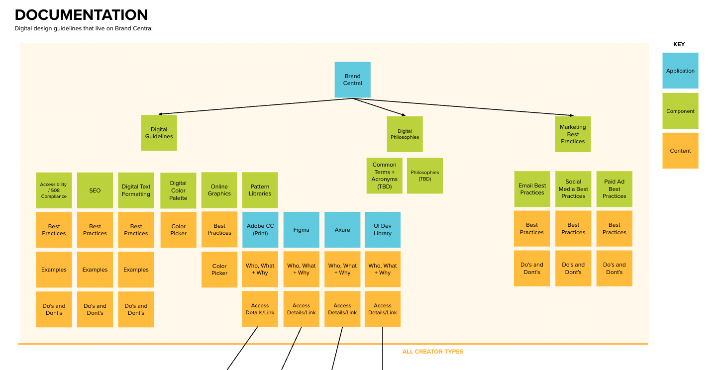
The ecosystem map to the right is a result of the discovery work. Digital design contributors got broken down into 2 groups of 6 user types, each with varying needs and technical capabilities.
-
After identifying our key areas of opportunity for the design system, I made a recommendation for the architecture and workflow that would automate and consolidate a lot of our pattern libraries between design and development:
Be intentional about the tools in our stack. Define which tools we will use and recommendations of why to use each.
Be inclusive by having empathy for our different types of digital creators, their expertise and what they need to get their jobs done.
Connect libraries for more efficient management. Design tokens in Figma will connect design with development. Developers would just need to push the tokens from Figma into their UI development tool.
-
It’s projected that we will have a 151.2% ROI after initial investment costs like software and labor, compared to projected labor investment reallocation benefits.
We estimate we will save designers and developers 50% of the time they spend in tools doing repeatable tasks, resulting in a savings of 1.68 million dollars a year.
We estimate we will save $800,000 a year in external design and development vendor fees.
Other areas of measurement would include faster speed to market and test to learn, strengthen brand reputation and democratize digital experience creation to other appropriate roles.
The slides below show more detail into the design system and guidelines.


Stjude.org Mobile Navigation Enhancements
I guided enhancements to stjude.org mobile experience including brand updates, search and recommendations for higher donation conversation rates.

-
I co-facilitated a design sprint and performed moderated and unmoderated user testing that highlighted several issues users were encountering:
Search was too hidden at the bottom of the mobile menu.
Users didn’t mind using the navigation on desktop, but in mobile they wanted to search.
Our content management system needed to allow for larger standard text sizes so it’s easier for users to scan content on their phones.
-
We added search under the main menu. This grew searches on the site by 200%.
Once search was added to the menu, it decreased conversions. We condensed the header to the way it exists today so more content could fit on an initial screen.
We needed to give our UX and content contributors a more simple template in the content management system for experiences where users didn’t require navigation. This template is used heavily by our performance marketing team to convert donors visiting from paid ads.
Our navigation content needed to flex and respond to the content our users were looking for. Many users at the time were interested in careers, so we added an extra tab on the homepage.